PROJECT OVERVIEW
Tilth Alliance is a community comprised of farmers, gardeners, and sustainable eaters. Their mission is to “build a sustainable, healthy, and equitable food future”. Tilth’s visual design system was outdated and the essence of who they are as a company was not communicated across their site. Additionally, their primary services and products were not clearly visible and intuitively labeled in their navigation system.
The goal for this visual system redesign was to emphasize the core characteristics of Tilth, which are fun, engaging, playful, organic, and to make their core offerings easy to find.
TIMELINE
10 weeks (Oct 2020 - Dec 2020)
ROLE
Visual designer
DELIVERABLES
High-fidelity visual design
TOOLS
Figma
DESIGN QUESTION
How might we create a fun, engaging, playful, and organic visual design system?
THE PROBLEM
Tilth Alliance’s visual system was dated, cluttered, and lacked excitement. It was difficult to understand the difference between their two navigation systems and their core offerings where not clearly emphasized.
DESIGN GOALS
Embody the core characteristics of Tilth throughout all components of their visual design system.
Clearly emphasize primary products and mission statement on the home page.
Increases scannability and reduce cognitive overload.
DESIGN SYSTEM COMPONENTS
A playful logo design
Tilth’s logo was designed to embody the playfulness of their brand. The logo uses a combination of wordmark and pictorial mark to accomplish this. The “i” in Tilth is a pictorial illustration of a carrot which symbolize Tilth’s farm roots. The carrot changes colors across each page, which creates a fun and engaging digital experience.
The terminals for each letter are suggestive of plant leaves to capture Tilth’s organic qualities.
Defined grid system
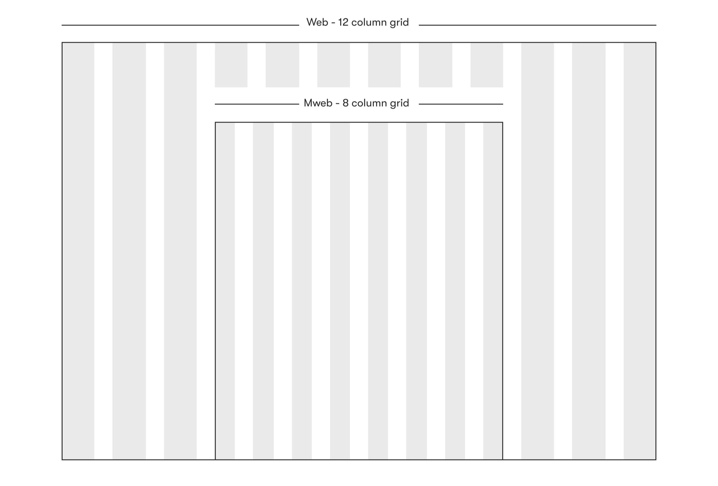
A 12 and 8 column grid is used for desktop and mobile web, respectively. This allows for greater flexibility in displaying Tilth’s programs, services, and events without overwhelming the user.
Tilth’s content is divided into modules, and each module is separated by vertical and horizontal white space. This increases scannability and reduces cognitive overload allowing the user to better digest Tilth’s content. The cascading background illustrations intentionally break the grid and help to capture the fun and playful essence of Tilth.
A balanced typeface
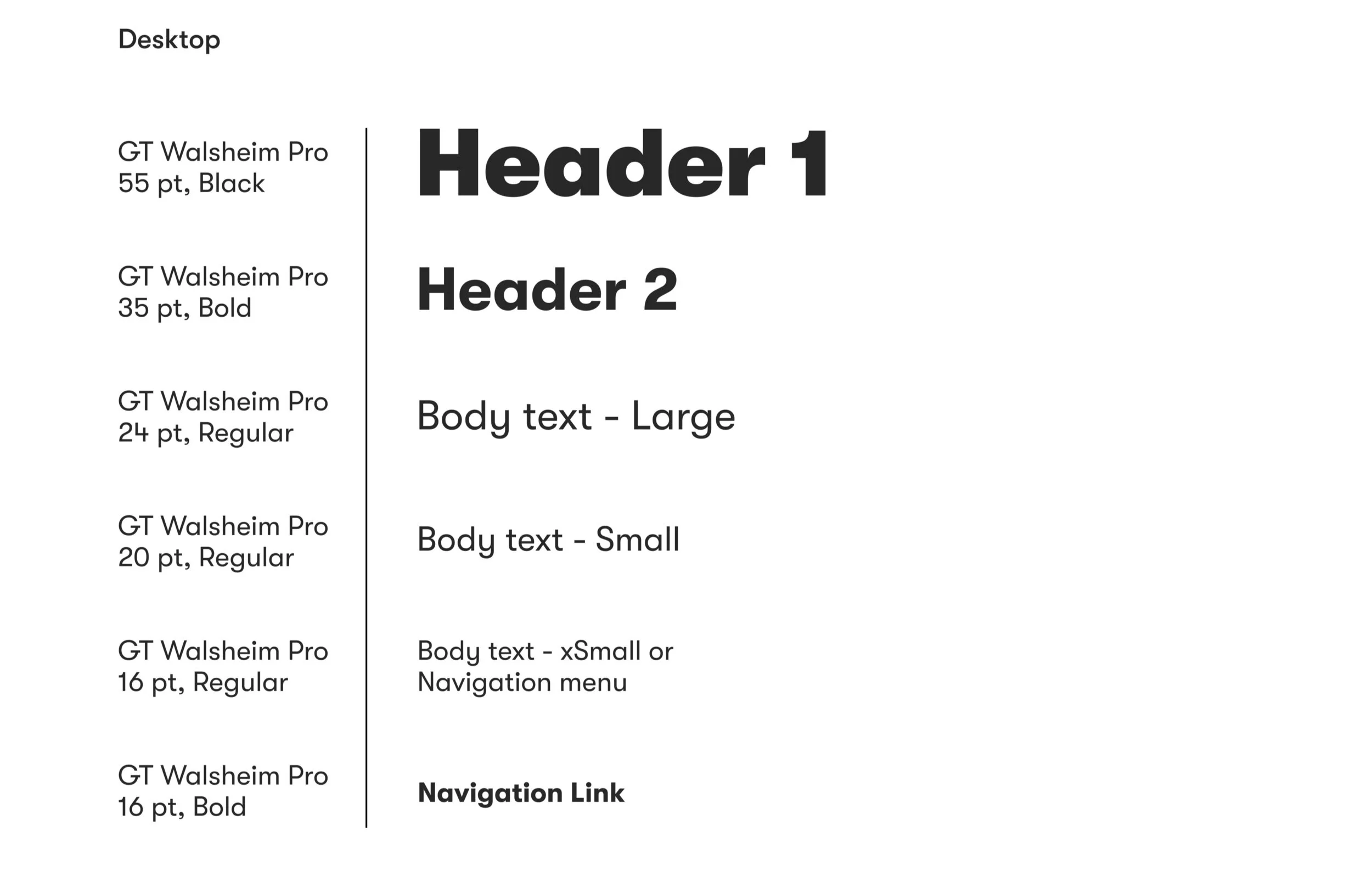
The GT Walsheim Pro is a geometric sans-serif typeface that is friendly, yet balanced. The circular counters and bowls in the letters evoke feelings of warmth and play. However, the straight and precise terminals provide a structured balance.
The GT Walsheim Pro typeface is friendly and warm to express Tilth’s brand characteristics, yet balanced for readability.
An interactive color palette
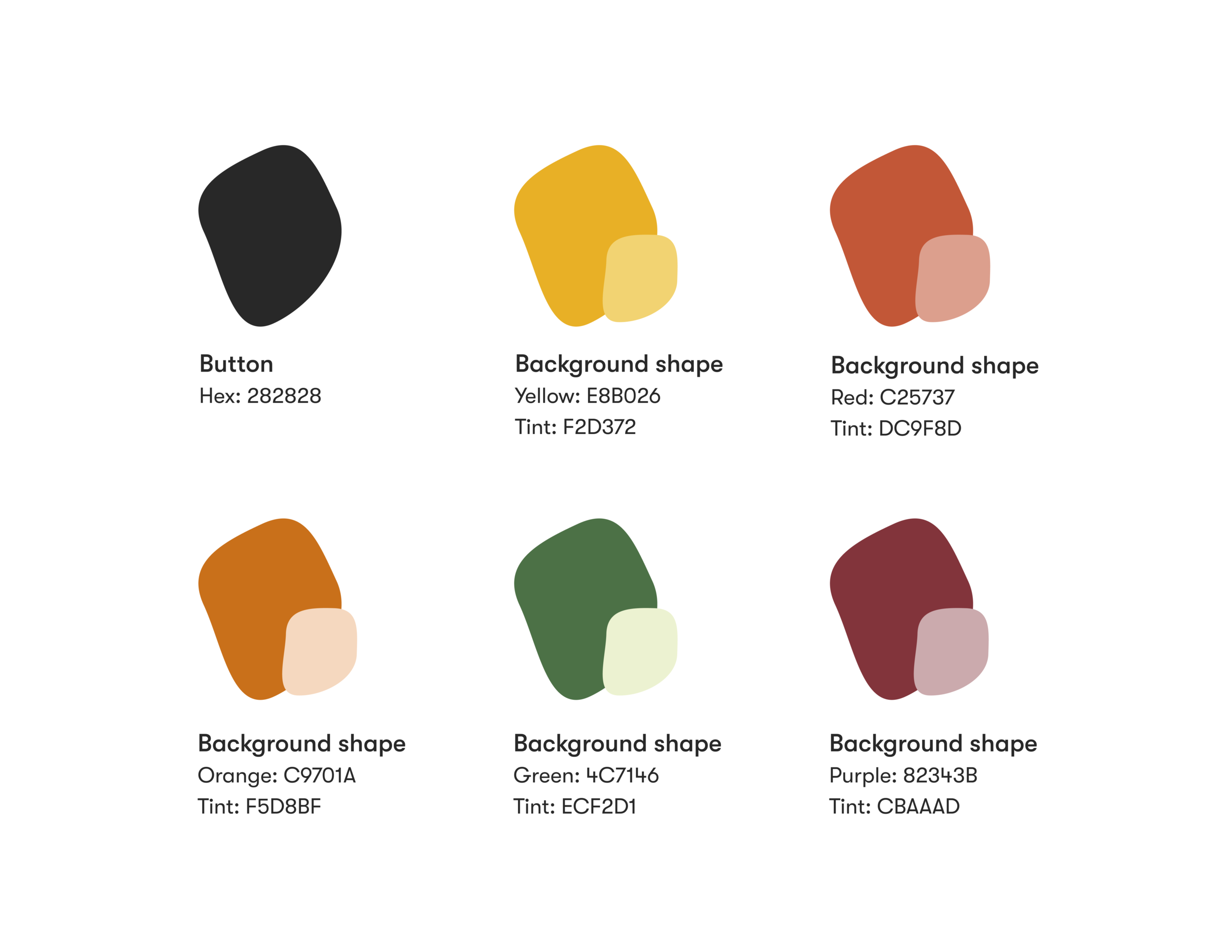
Tilth’s colors are comprised of a combination of secondary and tertiary colors, which represent the various colors of produce. Each color hue is displayed using an organic shape that is cascaded across the background of the site to create an interactive and engaging site experience.
Each color hue is paired with its matching tint in the form of an organic shape.
Natural and active imagery
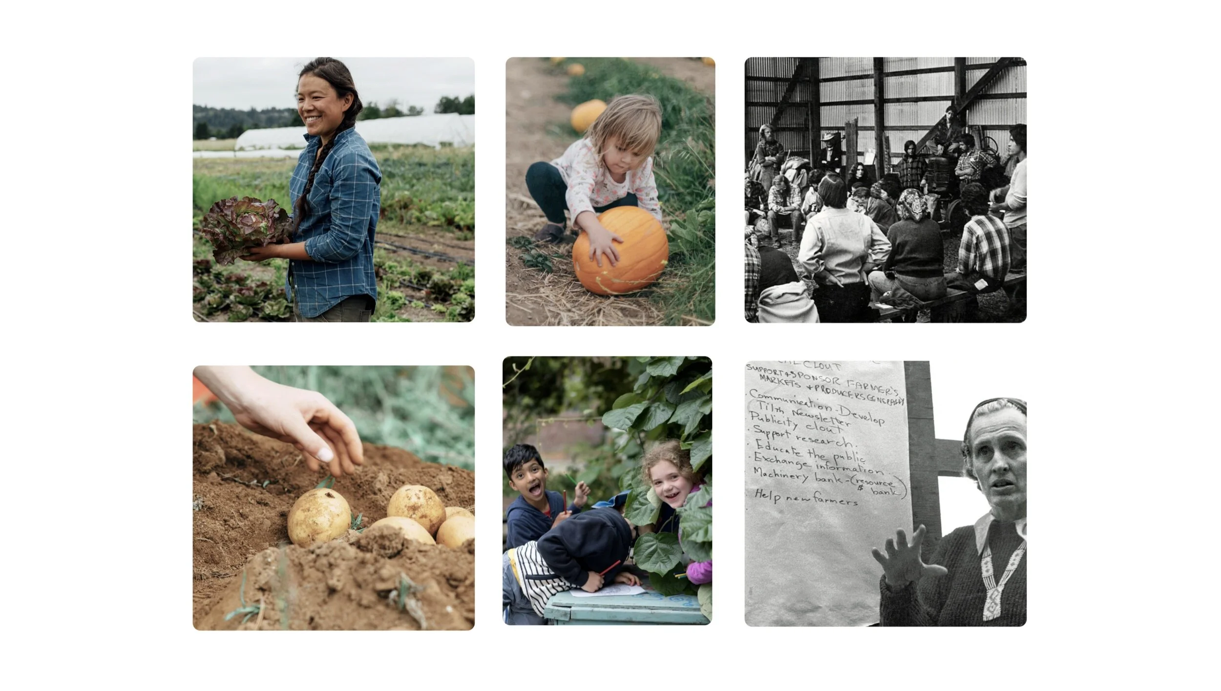
Tilth’s images are active and lively. Images show people working on a farm and/or interacting with one another.
All images are natural and unedited with little to no filters. This creates a fresh, natural, and organic feel which supports Tilth’s brand.


