PROJECT OVERVIEW
Almost 90% of United States households own a microwave. However, microwaves are still seen as unreliable, outdated, and confusing. The microwave user interface contains features that oftentimes require the use of an instruction manual. This information overload leaves users confused, forcing them to primarily use the features that are safe, and to experiment with unknown features through trial and error.
This HCDE graduate student design project reimagines the modern microwave from the ground-up.
ROLE
Lead researcher and visual designer (developed the research strategy and created the visual designs)
TOOLS
Miro, Cardboard, Figma
TIMELINE
10 weeks (Oct 2020 - Dec 2020)
DELIVERABLES
High-fidelity prototype
DESIGN QUESTION
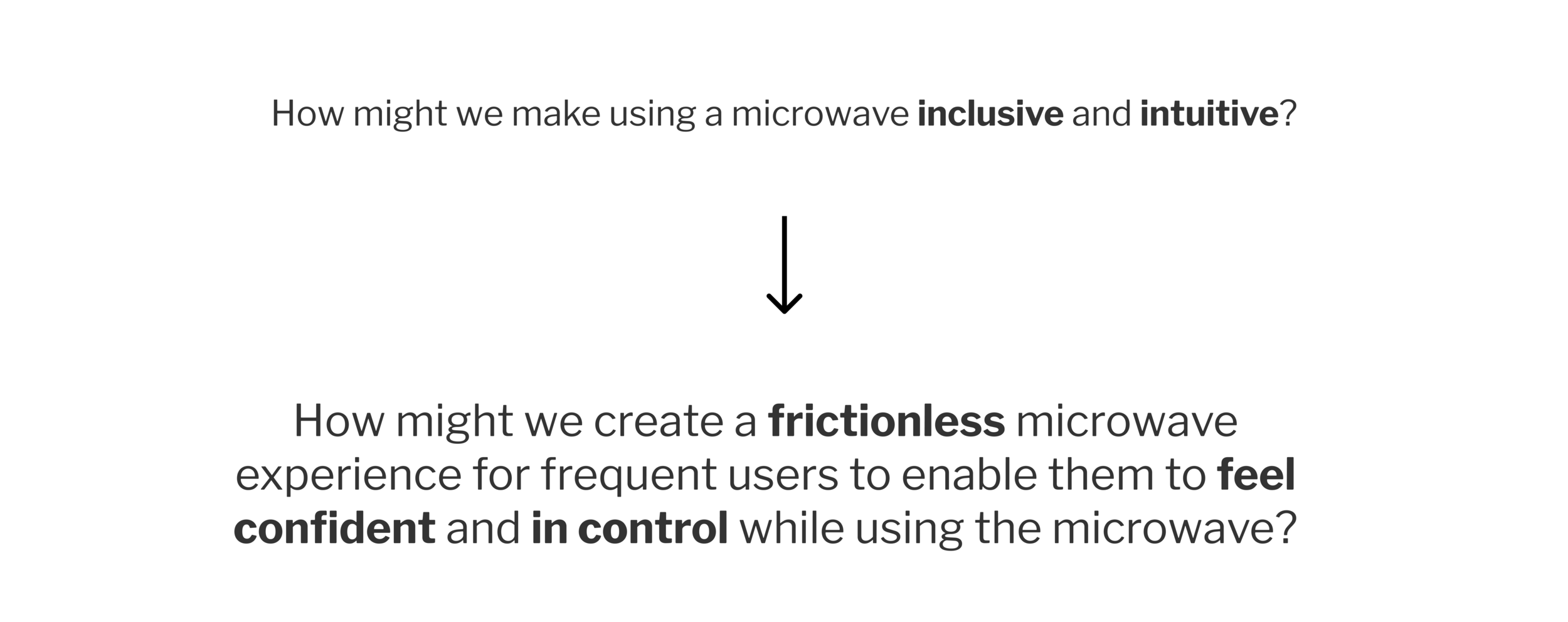
How might we make using a microwave inclusive and intuitive?
THE SOLUTION
Colina, a smart, cutting edge, and intuitive microwave
Read on to learn more about how we developed this innovative microwave experience.
RESEARCH
In order to redesign the microwave, our research objective was to better understand how users experience the microwave. We sought to understand the goals users seek to accomplish when using the microwave, unmet needs, and general attitudes and feelings towards the microwave.
To gather this information, we created a survey, conducted semi-structured and contextual interviews. Click here to view the complete research summary.
ANALYZE & SYNTHESIZE
After conducting research, we gathered to analyze our research findings and make sense of the data. We organized the microwave use into 3 phases: pre-cook, mid-cook, and post-cook. From there, we created affinity groups of the user needs for each phase and identified user goals.
User goals
After analyzing our research, we discovered 1 experience goal and 2 end goals:
Experience goal (How users expect to feel while using the microwave.)
I want to feel confident and in control while using the microwave.
“I want the ownership of the result to be put on me as a user, not the microwave.”
End goals (What users want to accomplish when using the microwave.)
I want my food cooked quickly.
I want my food cooked correctly.
“If it [the microwave] heats my food to the correct temperature I am happy.”
User needs
We created a user journey map and identified user needs for each step of the microwave experience.
After analyzing user needs, we discovered the following unmet needs hindered users from meeting their goals.
Assistance
Users are not sure how much time is required to heat their food.
When using the presets, users are not sure what settings to enter. (ex: weight, power level)
Clear & actionable labels
Users want to feel confident that the microwave will work as per their expectations.
Users don’t want to rely on an instruction manual and want the labels to explicitly tell them what action the microwave will perform.
Assurance
Users rely on trial and error to ensure their food is heated correctly.
They want assurance that their food will be cooked thoroughly to the right temperature.
Transparency
While their food is cooking, users want to understand what is happening after they press “start”.
Users want to know when their food will be ready without having to guess.
Attitude & feelings
We discovered that users view the microwave as a means to an end and prefer it to “just do its job”. There is a low level of interest in experimenting with using unknown features of the microwave. Users prefer to stick with what they know in order to get their food heated quickly.
“The microwave is a second class citizen in the kitchen. The microwave just needs to heat food, that’s it.
”
As a team, we decided that users view the microwave as a “second class citizen” due to an outdated user interface that does not fulfill user needs and goals.
In response to this, we designed an experience that would elevate the microwave to a “first class citizen status”. We did this by incorporating smart technology and a familiar design that aligns closely to how users currently use the microwave and other smart digital displays.
REFINED DESIGN QUESTION
Refining the problem
After analyzing our research data, we determined that users want ownership and control of the equipment and they want to feel confident while using the microwave.
Therefore, our reframed problem statement focuses on how we can create this experience for the users
DESIGN GOALS
Based on our user research findings, we came up with a set of design goals and corresponding design requirements.
1. Our design should help users feel confident and in control by:
Giving them ownership over the settings used to heat their food.
Providing transparency while their food is being heated.
Providing sensory feedback when the user inputs and after their food is done.
2. Our design should minimize user mental load by:
Having clear, actionable, understandable labels that take the mystery out of microwave buttons.
Having similar interaction aspects as current technology experiences.
Let users know when food is ready for their specifications.
Remaining accessible for users with varying disabilities.
3. Our design should heat the food to users expectations by:
Heating the food to the desired temperature.
Heating the food evenly.
IDEATE
Ideating on design solutions
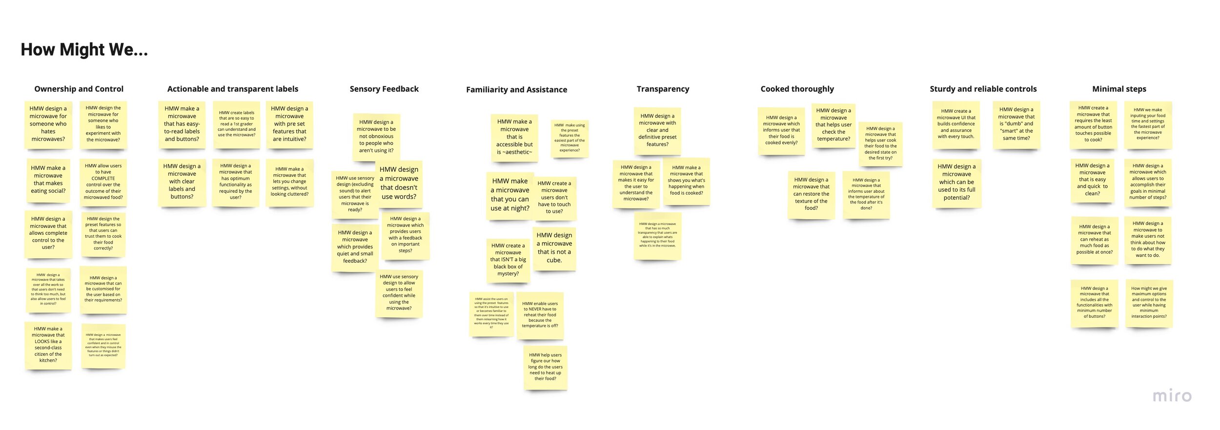
We ideated on design solutions using How Might We statements, prioritized our solutions, and created sketches and storyboards to visualize our ideas.
After ideating and prioritizing, we decided on the below design features to best help users to accomplish their goals.
Heat by time
User Goals:
I want to feel confident and in control while using the microwave.
I want my food cooked quickly.
The heat by time is a standard functionality and allows users to directly enter the time in order to heat their food. We kept this feature because in our survey 78% of respondents found the +30 second button helpful and 80% of respondents found the number pads or number dials themselves helpful.
Heat by temperature
User Goals:
I want to feel confident and in control while using the microwave.
I want my food cooked correctly.
This functionality allows for users to specify the desired average internal temperature of their food, giving them maximum confidence and control over their microwave experience.
Heatmap
User Goals:
I want to feel confident and in control while using the microwave.
I want my food cooked correctly.
In every single progress screen, a heatmap displaying the internal food temperature distribution is shown. This addition marks a major departure from the traditional microwave design.
Defrost
User Goals:
I want to feel confident and in control while using the microwave.
I want my food cooked correctly.
We redesigned the defrost functionality to include smart sensors that automatically detect the food item and the weight.
Prototype
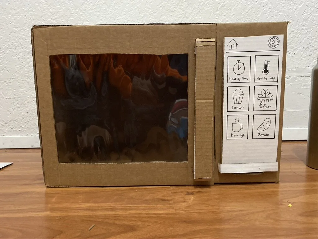
Cardboard prototype
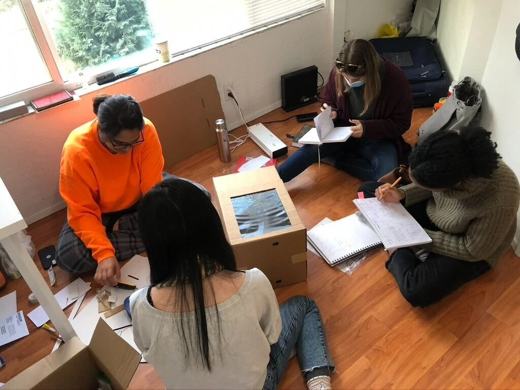
We created a physical 3-dimensional cardboard model prototype with the intention of using this design in the usability testing process. Microwaves are appliances users directly interact with, therefore we thought that a 3-D physical prototype would offer the most realistic interaction experience for our usability testers.
USABILITY TEST
Testing our design
Using the low-fidelity cardboard prototype, we conducted an "open-curtain" style Wizard of Oz usability test on 5 test participants. Each participant was given the following four tasks:
Follow the following instructions to heat your leftovers.
Follow the instructions on the frozen food package to heat your food.
Use this microwave to defrost your frozen seafood.
Lower the volume of the microwave "beep".
Test Results
Click here to view the video recordings of the usability tests.
What Did Not Work
'Touch to activate' screen was an unnecessary extra step.
Food temperature indicators on the progress screen were unclear.
Users struggled to recognize the estimated time display on the heat by temperature progress display.
"Heat by Temperature" function tended to be misunderstood as power level by users.
What Worked
The digital format was intuitive to navigate.
The Heat by Time function was straightforward.
Users found the Heat by Temperature function very helpful.
Participants were able to successfully navigate to the settings and edit the volume.
High-Fidelity Design
After analyzing our test results, we implemented the findings from our usability test and I created the high-fidelity visual designs for Colina. Click here to interact with the high-fidelity prototype.
Heat by time
Heat by Temperature
Defrost
Settings
Learnings and Next Steps
Working on this project was a lot of fun, because it gave me the opportunity to think outside of the box and design an experience that was not a mobile application or website. This ignited a true passion within me for designing physical products and I am excited to see where that takes me. This design project solidified the importance of goal-centered design and I hope to continue using this design strategy in future projects.
The COVID-19 pandemic limited our access to high-fidelity 3D prototyping tools. Therefore as next steps, we would be interested in developing a high-fidelity 3D physical prototype.


